Interpreting the Enhanced Feedback Report

Mirah presents client-level clinical feedback in a comprehensive, interactive report. This report is the core of Mirah for clinicians using the platform and provides invaluable insight to guide care and clinical decision making.

**Please Note: Not all Mirah customers have access to the Enhanced Feedback Report. If this interface does not look familiar to you, and you're interested in learning more, please reach out to your Customer Success Manager or email support@mirah.com.

Understanding the Layout​

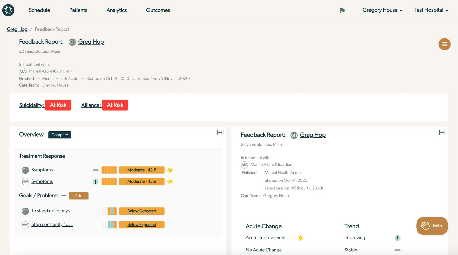
The screenshot displays the Enhanced Feedback Report for a patient named Greg Hop, who is 22 years old and male. The report is part of the Mirah Collaborative Care platform, under the Feedback Report section. The top navigation bar includes options for Schedule, Patients, Analytics, and Outcomes, with user and location details on the right. The breadcrumb trail shows the path: Greg Hop / Feedback Report. The main section provides patient details, including the care team led by Gregory House and treatment specifics with Mariah Azure as the guardian. The report indicates that Greg is at risk for suicidality and alliance, highlighted in red. The Overview section includes a Compare button and details on Treatment Response, showing symptom scores for both Greg and Mariah Azure, marked as moderate with numerical values and visual indicators. The Goals/Problems section lists specific goals with their progress status as below expected. The right panel summarizes the feedback report, acute change status, and trend indicators, with a Help button located at the bottom right.

Orienting to the Report Layout​

Header

At the top of the screen, you’ll find basic information about the client. Initials presented in a dark gray circle indicate the client and their associated information and responses. Initials visualized in the light gray circle, if present, represents the caregiver. Throughout the report, you can always tell who the respondent for an item was by looking to the left of the measure for these identifiers. Other pertinent information includes client demographics, information about the active care episode, and the care team.
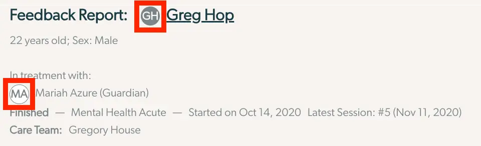
The screenshot displays a section of the Enhanced Feedback Report for a patient named Greg Hop, indicated by the initials 'GH' in a circular icon next to his name. The report provides demographic information, stating that Greg is 22 years old and male. It details his treatment information, showing he is in treatment with Mariah Azure, who is identified as his guardian, with her initials 'MA' in a circular icon. The treatment program is labeled as 'Mental Health Acute,' which started on October 14, 2020. The report notes that the latest session was the fifth one, held on November 11, 2020. Additionally, the care team is listed as Gregory House.

Risk Screening

Underneath the basic information in the header, there is a section for risk screening. This presents critical information related to risk screening and management. If more information is needed for any of the risks, clicking on the badge will bring up the most recent item responses in the right “Details” panel. From there, using the navigation at the top of the right hand panel, the user can view the entire risk history and item responses from past dates. See “Badge Details: Responses” below for more information.

There are three risk badges that may be present, based on the administered scales. They are:

  • Suicidality
  • Alliance
  • Substance Use
  • Medications The screenshot displays a section of the Enhanced Feedback Report in Mirah Collaborative Care, which provides a quick overview of various risk factors and their current status for a patient. The screen shows four categories: Suicidality, Alliance, Substance Use, and Medications. Each category is followed by a status indicator. 'Suicidality' is marked as 'Minimal' with a green background, indicating low risk. 'Alliance' is marked as 'At Risk' with a red background, highlighting a potential concern. 'Substance Use' is also marked as 'Minimal' with a green background, suggesting low risk. 'Medications' is marked as 'No Concerns' with a green background, indicating no issues. This layout helps clinicians quickly assess areas that may require attention or intervention.

Two Panel Layout

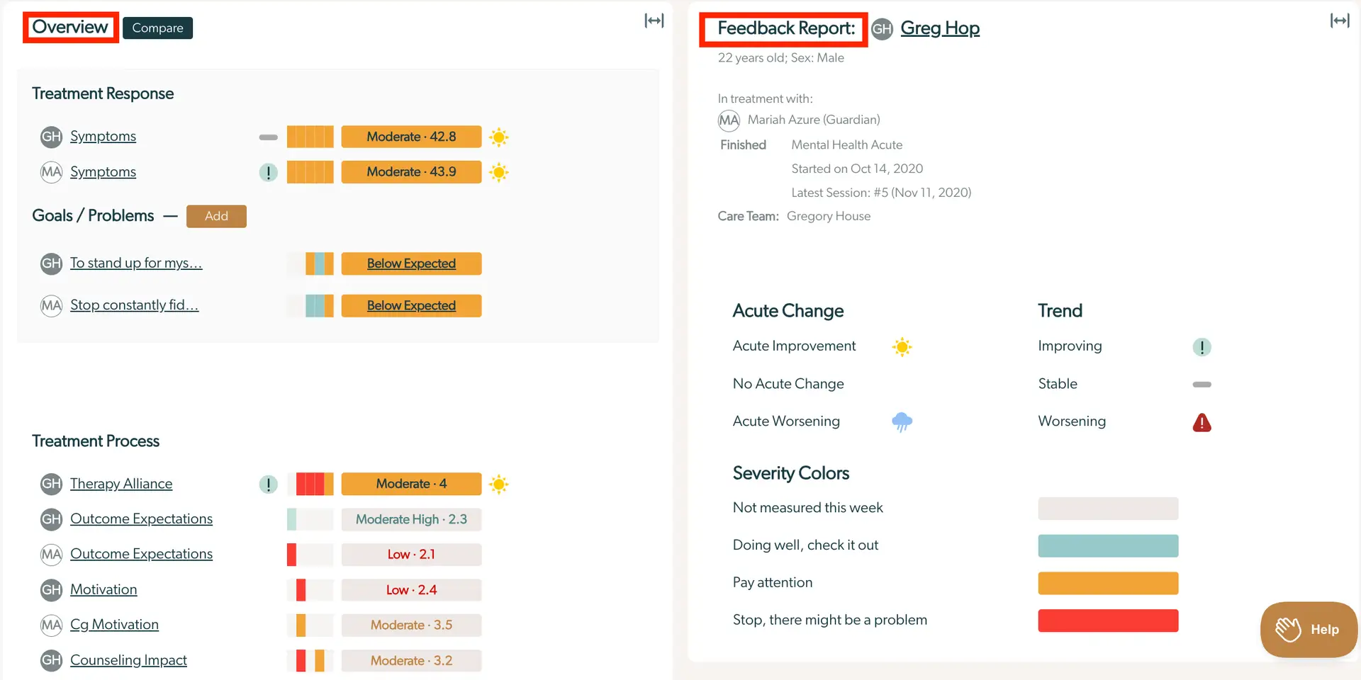
The screenshot displays the Enhanced Feedback Report for a patient named Greg Hop, aged 22, male. The screen is divided into two main sections. On the left, under the 'Overview' tab, there is a 'Treatment Response' section showing symptoms with a moderate severity level, indicated by orange bars and a sun icon. Below, the 'Goals / Problems' section lists goals such as 'To stand up for myself' and 'Stop constantly fidgeting,' both marked as 'Below Expected' with color-coded bars. The 'Treatment Process' section includes items like 'Therapy Alliance,' 'Outcome Expectations,' and 'Motivation,' each with severity ratings ranging from low to moderate, indicated by colored bars and icons. On the right, the 'Feedback Report' section provides patient details, treatment history, and care team information. It includes 'Acute Change' indicators with icons for improvement, no change, and worsening, and a 'Trend' section showing status as improving, stable, or worsening. Severity colors are explained at the bottom right, with a 'Help' button located in the lower right corner.

The remainder of the report navigates between two panels. On the left “Overview” panel, the full overview or compare view will always be present. Within the right “Details” panel, the information will change based on what is selected from the left panel and how the navigation bar at the top of the right panel is utilized. At any time, the “Expand” button can be used to expand or minimize either panel, for more focused viewing.

The screenshot displays the top section of the Enhanced Feedback Report feature in the Mirah Collaborative Care platform. On the left side, there is a navigation option with 'Overview' in plain text and a 'Compare' button next to it, which is highlighted in a dark color indicating it is the active selection. On the right side, the report is titled 'Feedback Report' followed by the name 'Greg Hop' with initials 'GH' in a circular icon. Below the name, demographic details are provided: '22 years old; Sex: Male'. There is an icon with two arrows pointing outward located at the top right corner, which likely serves as a button to expand or adjust the view of the report.

Compare

Clicking the “Compare” button allows you to choose any measures by any reporter to view. This is useful to understand patterns or limit the amount of information to focus attention on something in particular. Select the measures that you’d like to compare using the checkboxes. This shows the graph of past responses for those measures within the left panel. The data points on this view are clickable and selecting one will populate details in the right panel (see below “Badge Details: Responses” for additional information on item level responses).
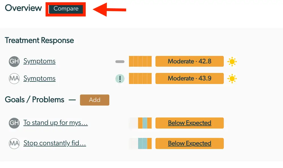
The screenshot displays the Enhanced Feedback Report screen within the Mirah Collaborative Care platform, focusing on the 'Overview' section. At the top, there is a 'Compare' button highlighted in a dark color, located next to the 'Overview' title, which allows users to compare different data sets. Below, the 'Treatment Response' section lists two entries, each with a circular icon labeled 'GH' and 'MA', followed by the word 'Symptoms' as a hyperlink. Each entry has a horizontal bar graph indicating the severity level, labeled as 'Moderate' with scores of 42.8 and 43.9, accompanied by a sun icon suggesting a positive outcome. The 'Goals / Problems' section follows, with an 'Add' button in orange for adding new goals or problems. Two entries are listed, each with a circular icon labeled 'GH' and 'MA', followed by truncated text links 'To stand up for mys...' and 'Stop constantly fid...'. Each entry has a horizontal bar graph indicating performance, labeled as 'Below Expected'.

Treatment Response

Treatment response shows information related to how the client is progressing in treatment, such as symptoms and goal attainment. Using the “Add” button opens editable fields in the right panel that allow the clinician to add different types of goals for either the client or the caregiver from within the report.
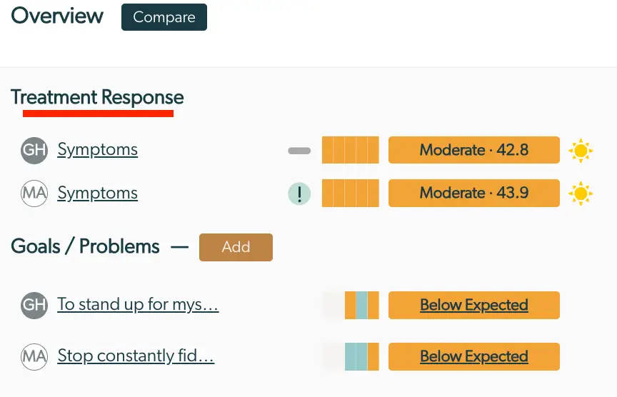
The screenshot displays the Enhanced Feedback Report within the Mirah Collaborative Care platform, focusing on the 'Overview' section. At the top, there is a 'Compare' button for comparing data. The 'Treatment Response' section lists two entries with initials 'GH' and 'MA', each associated with a 'Symptoms' link. Next to these, there are visual indicators showing a moderate response level with scores of 42.8 and 43.9, respectively, accompanied by a sun icon suggesting a positive outlook. Below, the 'Goals / Problems' section allows users to add new entries via an 'Add' button. It lists goals for 'GH' and 'MA', with truncated text indicating specific goals. Each goal is evaluated as 'Below Expected' with corresponding visual indicators. The layout is designed to provide a quick overview of treatment responses and goal progress.

Goals/Problems

The Goals section allows for tracking of goals progress, over time. Any goals or problems that the patient (and/or caregiver) have been working towards are highlighted here. Selecting the “Add” button allows the user to add more goals from the report, as well. The drop down within the goal section allows for selecting a “Top Problem”, “7 point Likert Goal”, or “Goal Attainment Scaling” to automatically add to the report.
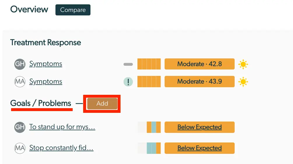
The screenshot displays the Enhanced Feedback Report within the Mirah Collaborative Care platform, specifically under the 'Overview' section. At the top, there is a 'Compare' button for comparing data. The report is divided into two main sections: 'Treatment Response' and 'Goals / Problems'. In the 'Treatment Response' section, there are entries for 'GH Symptoms' and 'MA Symptoms', each with a graphical representation of progress, a severity rating labeled as 'Moderate' with corresponding numerical values (42.8 and 43.9), and a sun icon indicating positive progress. The 'Goals / Problems' section lists goals such as 'To stand up for mys...' and 'Stop constantly fid...', each with a progress bar and a status labeled 'Below Expected'. There is an 'Add' button located next to the 'Goals / Problems' heading, allowing users to add new goals or problems.

Other Scales

The bottom section of the left panel presents the information related to the rest of the scales from the respondents. Scales are grouped by domains that organize scales measuring similar psychometric constructs. The names shown in the report are typically the construct names. However, when selecting a scale to view the details, the scale name is also displayed.

Deeplinking​

The enhanced feedback report supports deeplinking.

Interpreting the Enhanced Clinical Feedback Report​

Overview Panel

The “Overview” Panel has common elements for all scales administered. This includes who responded, what is being measured, trend over time, a heatmap indicating the change over time, the current/most recent score, and any acute changes in the scale since the last session. Each section below explains one of these common elements and how to use them to interpret the report.
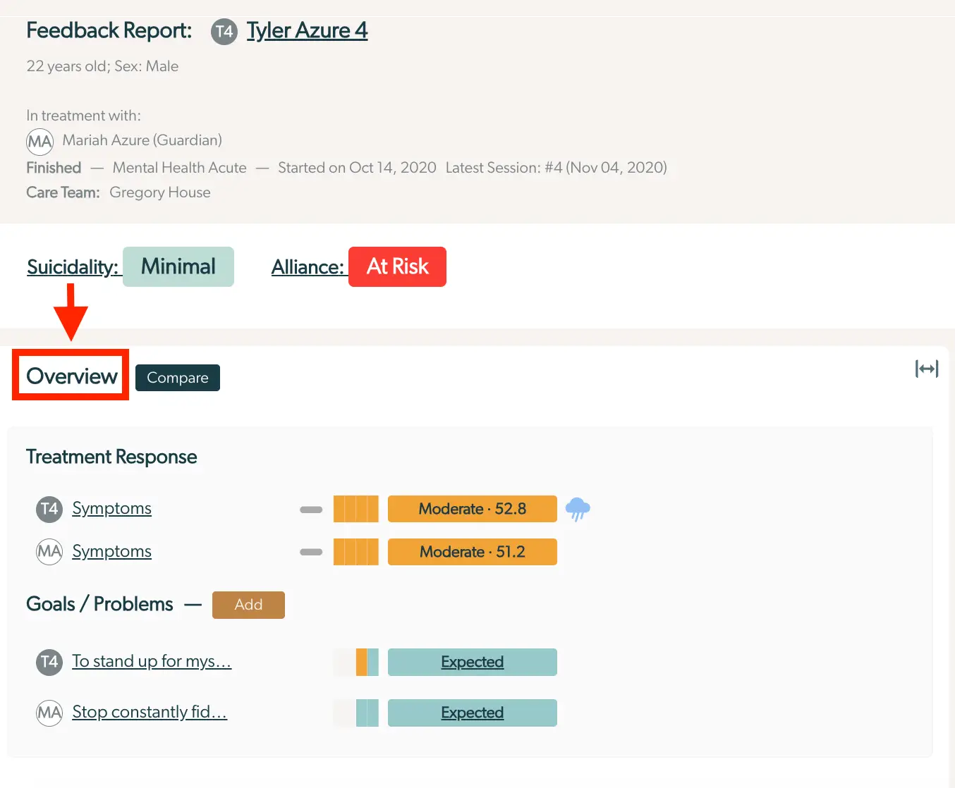
The screenshot displays the Enhanced Feedback Report for a patient named Tyler Azure, aged 22, male. The report is part of the Mirah Collaborative Care system, which supports measurement-based care. The top section provides basic patient information, including the treatment with Mariah Azure (Guardian), the status of the treatment as finished, the type of treatment (Mental Health Acute), the start date (October 14, 2020), and the latest session date (November 4, 2020). The care team is listed as Gregory House. Below this, the patient's suicidality is marked as 'Minimal' and alliance as 'At Risk'. The main section of the report is titled 'Overview', with a 'Compare' button next to it for further analysis. The 'Overview' tab is highlighted, indicating it is the current view. The 'Treatment Response' section shows symptom scores for Tyler Azure and Mariah Azure, both marked as 'Moderate' with scores of 52.8 and 51.2 respectively. The 'Goals / Problems' section lists goals for both Tyler Azure and Mariah Azure, with an 'Add' button for adding new goals. The goals are marked as 'Expected'. The interface is designed to provide a comprehensive view of the patient's treatment progress and goals.

Trend

The trend over time icon appears for any measure that has three or more completed sessions. It indicates that the patient has been “Improving”, “Stable”, or “Worsening” over time since the measure was first completed. Hovering over the icon gives a text explanation of its meaning, for additional clarification. If there is no trend icon, the measure does not support trends and additional exploration can provide further details.
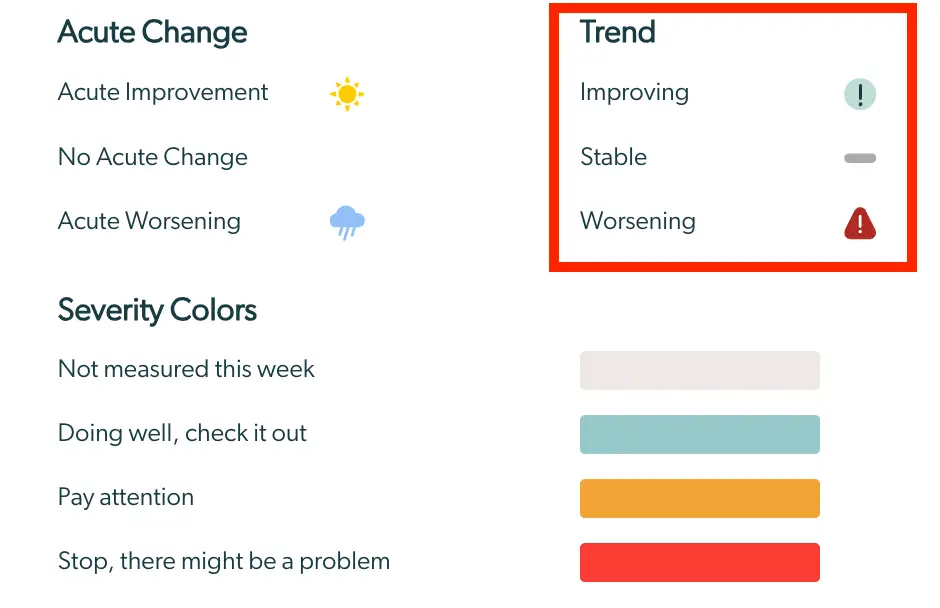
The screenshot displays a section of the Enhanced Feedback Report in Mirah Collaborative Care, focusing on interpreting trends and severity colors. On the left, under 'Acute Change,' there are three categories: 'Acute Improvement' with a sun icon, 'No Acute Change' with no icon, and 'Acute Worsening' with a cloud icon, indicating different levels of patient condition changes. On the right, the 'Trend' section is highlighted, showing three statuses: 'Improving' with a green exclamation mark icon, 'Stable' with a gray dash icon, and 'Worsening' with a red exclamation mark icon, which help in assessing the patient's progress over time. Below, the 'Severity Colors' section lists four color-coded statuses: a light gray for 'Not measured this week,' a teal for 'Doing well, check it out,' an orange for 'Pay attention,' and a red for 'Stop, there might be a problem,' providing a visual guide to the urgency of the patient's condition.

In the examples below, the client report of “Life Satisfaction” is stable, which means there has been no change since the first time the measure was completed. In other words, there might be some small differences in the responses to the measure at each time, but those differences were not significant. “Therapy Alliance”, however, shows an improving trend icon. This may mean that the symptoms are getting better or perhaps there is less awareness of the symptoms (and therefore less endorsement of symptoms) since the first administration of the measure.
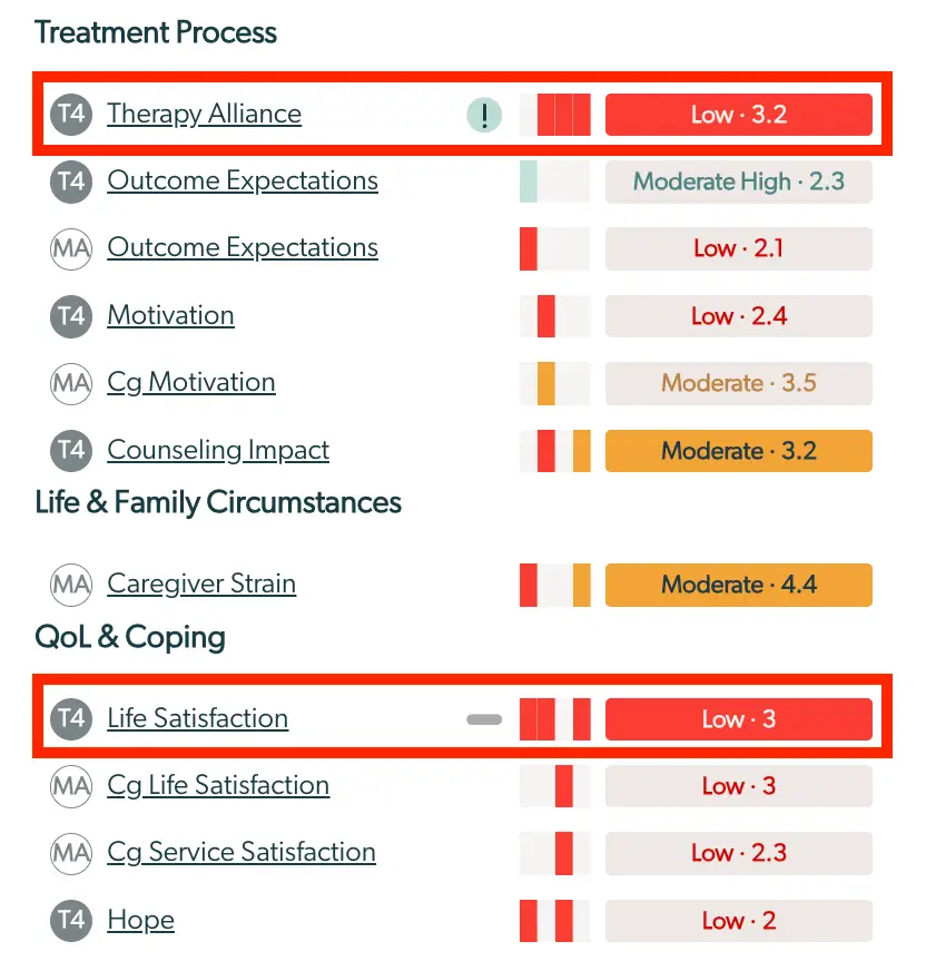
The screenshot displays the Enhanced Feedback Report, which is part of the Mirah Collaborative Care platform. It is divided into sections labeled 'Treatment Process,' 'Life & Family Circumstances,' and 'QoL & Coping.' Each section contains various metrics related to patient care, such as 'Therapy Alliance,' 'Outcome Expectations,' 'Motivation,' 'Counseling Impact,' 'Caregiver Strain,' 'Life Satisfaction,' 'Cg Life Satisfaction,' 'Cg Service Satisfaction,' and 'Hope.' Each metric is accompanied by a visual indicator of performance, represented by colored bars, and a numerical score with a qualitative label such as 'Low,' 'Moderate,' or 'Moderate High.' The 'Therapy Alliance' and 'Life Satisfaction' metrics are highlighted with a red border, indicating a low score of 3.2 and 3, respectively. The colored bars provide a quick visual assessment of the metric's status, with red indicating lower performance. The report is designed to help healthcare providers assess and track clinical progress and outcomes for patients.

Heatmap: Change Over Time

The heatmap for a measure appears inline following the indication of the respondent and what is being measured. Each heatmap is made up of colored chips that show all of the past responses for that respondent on the measure over the course of time. This is a useful guide to see the past scores on that measure all at once and the change over the course of time. The image to the right shows the heatmap with responses at every session, with gaps in administration (i.e. specific sessions were not scheduled to administer this measure), and with gaps in patient response (i.e. the measure was administered but the respondent did not answer at all or with enough responses to be clinically significant).

The heatmap noting responses at every session shows a worsening trend over the course of treatment, where a client started out in the low range and then over the course of a few sessions worsened and is now reporting scores in the moderate range.

Badge: Current Score

The most recent score for a measure appears as a badge inline following the heatmap. The badge color and the text both carry meaning.
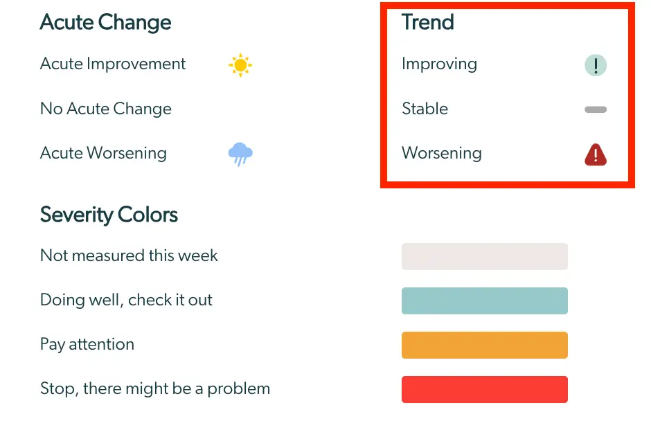
The screenshot displays a section of the Enhanced Feedback Report in Mirah Collaborative Care, focusing on interpreting trends and severity colors. On the left, under 'Acute Change,' there are three categories: 'Acute Improvement' represented by a sun icon, 'No Acute Change' with no icon, and 'Acute Worsening' represented by a cloud icon. On the right, under 'Trend,' there are three statuses: 'Improving' with a green exclamation mark icon, 'Stable' with a gray dash icon, and 'Worsening' with a red exclamation mark icon. Below these sections, 'Severity Colors' are listed with corresponding color bars: a light gray bar for 'Not measured this week,' a teal bar for 'Doing well, check it out,' an orange bar for 'Pay attention,' and a red bar for 'Stop, there might be a problem.' This screen helps users quickly assess patient status changes and the urgency of their conditions.

Color

The color of the current score badge and throughout the report correspond to a stoplight, where green represents “Doing well, check it out”, yellow represents the need to pause and “Pay attention”, and red indicates the clinician should “Stop, there might be a problem).

If the badge is gray, it indicates that the measure was not administered at the most recent session, based on how often it is scheduled to be administered. In this case, the text color and the heatmap provide insight into the measure’s responses the last time it was administered and responses were collected.
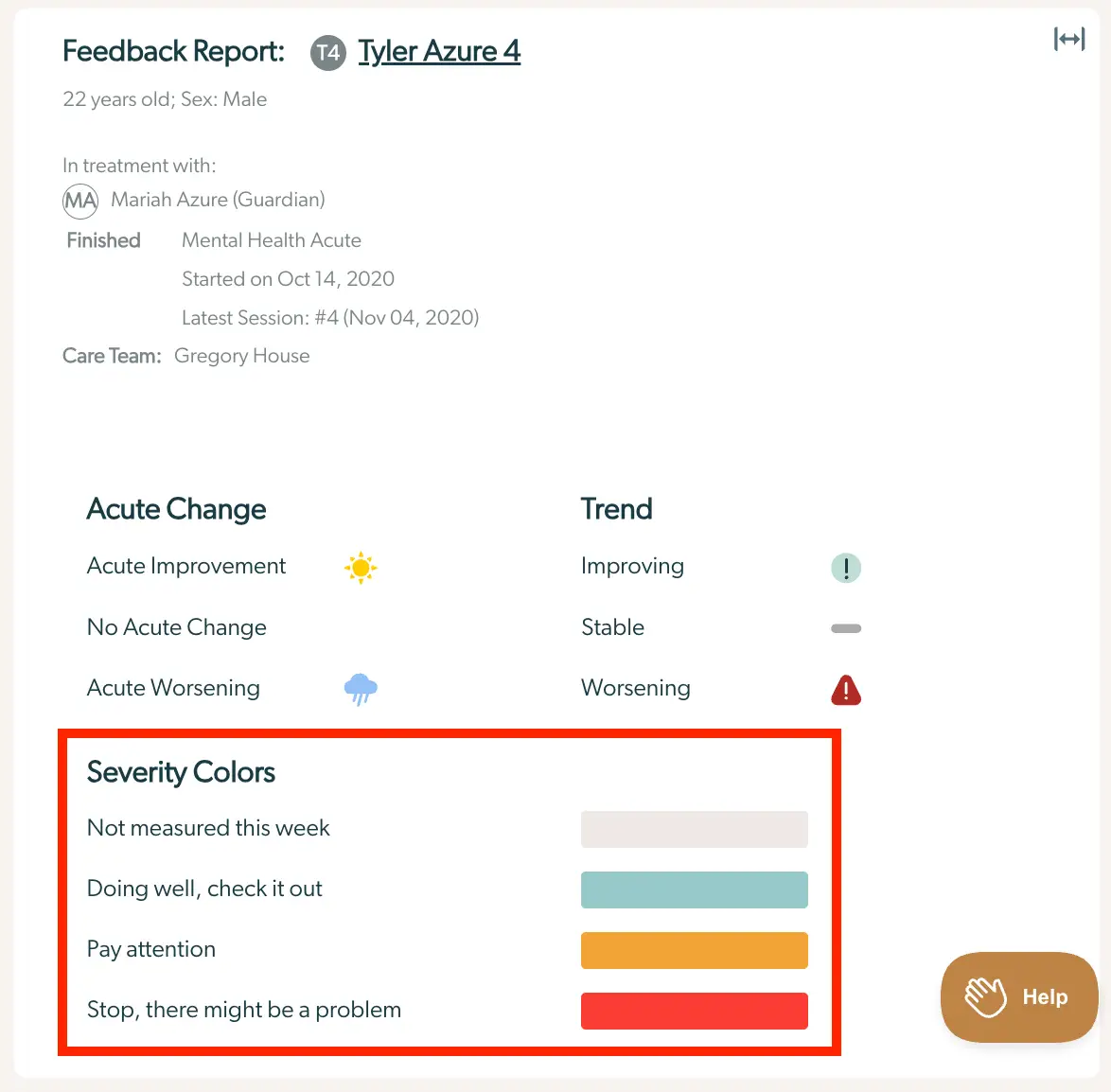
The screenshot displays the Enhanced Feedback Report for a patient named Tyler Azure, a 22-year-old male. The report is part of the Mirah Collaborative Care system, which supports measurement-based care. At the top, the report title 'Feedback Report: Tyler Azure 4' is shown, followed by the patient's age and sex. Below, it indicates that Tyler is in treatment with Mariah Azure, who is his guardian. The treatment is labeled as 'Mental Health Acute,' which started on October 14, 2020, with the latest session being the fourth on November 4, 2020. The care team includes Gregory House. The report is divided into sections: 'Acute Change' and 'Trend.' 'Acute Change' includes options for 'Acute Improvement' with a sun icon, 'No Acute Change' with a cloud icon, and 'Acute Worsening' with a rain cloud icon. The 'Trend' section shows 'Improving' with an exclamation mark icon, 'Stable' with a dash icon, and 'Worsening' with a warning icon. At the bottom, a 'Severity Colors' legend explains the color codes: light gray for 'Not measured this week,' teal for 'Doing well, check it out,' orange for 'Pay attention,' and red for 'Stop, there might be a problem.' A 'Help' button is located at the bottom right corner of the screen.

The full color palette through the report corresponds to shades of these 4 colors, based on the level of severity that is represented. This is seen both on the badges and also in the heatmaps, based on the measure and the responses that are available.

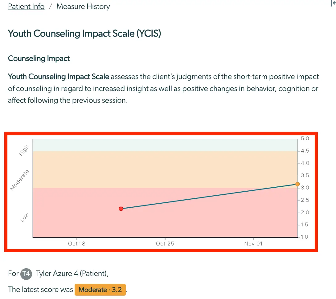
The screenshot displays a section of the Enhanced Feedback Report in Mirah Collaborative Care, specifically focusing on the Counseling Impact metric. On the left, there is a circular icon labeled 'T4', indicating a specific task or category. Next to it, the text 'Counseling Impact' is underlined, suggesting it is a clickable link or a highlighted section. An orange arrow points to the right, directing attention to a visual bar chart with three vertical bars of varying colors, representing different levels of impact. To the right of the chart, there is an orange rectangular label with the text 'Moderate · 3.2', indicating the current impact level and its numerical score. This layout helps users quickly assess the effectiveness of counseling interventions.The screenshot displays the 'Youth Counseling Impact Scale (YCIS)' section of the Enhanced Feedback Report within the Mirah Collaborative Care platform. It includes a header titled 'Counseling Impact' followed by a brief description of the YCIS, which assesses the client's judgment of the short-term positive impact of counseling. Below the description, there is a graph illustrating the client's progress over time, with a vertical axis labeled from 1.0 to 5.0 and horizontal axis marked with dates (Oct 18, Oct 25, Nov 01). The graph is color-coded into three sections: Low, Moderate, and High, indicating the level of impact. A line graph with data points shows the client's scores over the specified dates, with the latest score being 3.2, categorized as Moderate. At the bottom, there is a note indicating the score for 'Tyler Azure 4 (Patient)' with the latest score highlighted in orange as 'Moderate · 3.2'.

Text

The text within the badge corresponds to the measure itself. A low score on some measures is in the positive range while on others, it may be in the negative range or indicate higher severity. If the text is just a number or date, it means that the measure does not have clinical cutoffs or carry a score, respectively. In this case, going directly to the item responses can offer additional clinical insight.
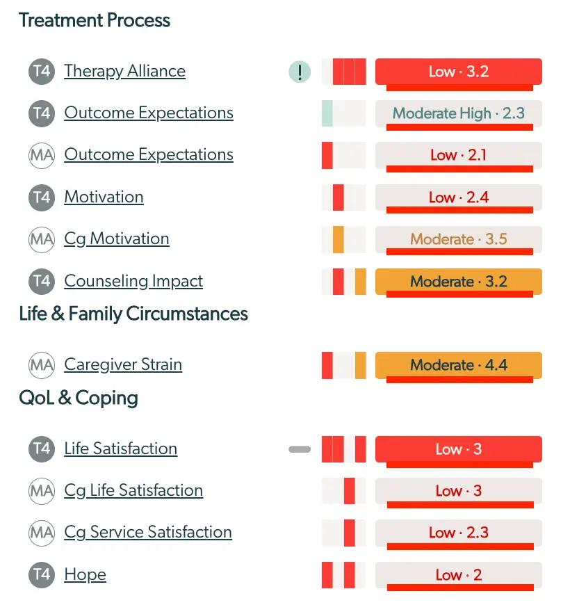
The screenshot displays the Enhanced Feedback Report feature of Mirah Collaborative Care, which is used to interpret various aspects of patient care and satisfaction. The report is divided into three main sections: Treatment Process, Life & Family Circumstances, and QoL & Coping. Each section lists different metrics with associated scores and visual indicators. In the Treatment Process section, metrics such as Therapy Alliance, Outcome Expectations, Motivation, and Counseling Impact are shown with their respective scores and color-coded bars indicating performance levels, ranging from Low to Moderate High. The Life & Family Circumstances section includes Caregiver Strain with a Moderate score. The QoL & Coping section lists Life Satisfaction, Cg Life Satisfaction, Cg Service Satisfaction, and Hope, all with Low scores. Each metric is accompanied by a circular icon indicating the type of assessment (T4 or MA) and a horizontal bar graph that visually represents the score. The scores are displayed to the right of the bars, with color coding to indicate the level of concern, such as red for Low and orange for Moderate.

Interpretation

Combining all of the information in a sentence can be helpful for interpreting the current score. In Example #1 below, low therapy alliance means there might be a risk or rupture to your working relationship with a client, which is something to stop and explore. In Example #2, low symptoms mean that symptoms are minimal compared to other clients receiving similar treatment.

The screenshot displays a section of the Enhanced Feedback Report in Mirah Collaborative Care, specifically focusing on the Therapy Alliance metric. On the left, there is a circular icon with the initials 'T3', representing the Therapy Alliance category. Next to it, the text 'Therapy Alliance' is displayed, indicating the specific metric being evaluated. To the right, there is a visual bar indicator with a red color, signifying a low score. The score is numerically represented as 'Low · 2.8', providing a quantitative measure of the Therapy Alliance's performance. This section helps users quickly assess the effectiveness of the therapy alliance within the collaborative care framework.The screenshot displays a section of the Enhanced Feedback Report focusing on symptoms. On the left, there is a circular icon with 'T7' indicating the type or category of the symptom assessment. Next to it, the word 'Symptoms' is prominently displayed, suggesting the focus of this section. Adjacent to the text is an exclamation mark icon within a circle, which may indicate an alert or important information regarding the symptoms. To the right, there is a horizontal bar graph with several orange segments, visually representing the symptom severity or frequency. The bar graph is followed by a label 'Low · 40.6' in a light green box, indicating the current level of symptoms measured, with 'Low' suggesting a lower severity and '40.6' providing a quantitative score. This layout helps users quickly interpret symptom data within the report.

Acute Change

Acute change compares the most recent score on a measure to the previous administration, to help the clinician understand whether a change in score is significant or not. When there has been an acute change since the previous administration, an acute change icon will be present. This icon represents that the change was large enough to reach a specified threshold (which varies by scale).
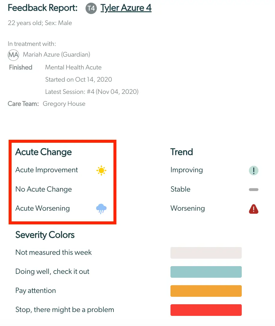
The screenshot displays the Enhanced Feedback Report for a patient named Tyler Azure, aged 22, male. The report is part of the Mirah Collaborative Care system, focusing on measurement-based care. The top section identifies the patient and treatment details, including the guardian Mariah Azure, the type of treatment 'Mental Health Acute', the start date October 14, 2020, and the latest session number 4 on November 4, 2020. The care team is led by Gregory House. Below, the 'Acute Change' section highlights the patient's current status with options for 'Acute Improvement' marked by a sun icon, 'No Acute Change', and 'Acute Worsening' marked by a cloud icon with rain. Adjacent to this, the 'Trend' section indicates the patient's progress with options 'Improving', 'Stable', and 'Worsening', each associated with respective icons. The 'Severity Colors' section provides a color-coded guide for interpreting the patient's condition: a light gray for 'Not measured this week', teal for 'Doing well, check it out', orange for 'Pay attention', and red for 'Stop, there might be a problem'.

Reaching this threshold may be clinically meaningful and indicate recent improvement or worsening over and above any natural variations that may occur. Perhaps there was a recent event in the client’s life, or something else to be explored further in session. Hovering over the icon gives a text explanation of its meaning, for additional clarification. If there is no acute change icon, no acute change for that measure was indicated since the last administration.

In the examples below, the client report of “Symptoms'' was “Moderate” and orange, as an item to pay attention to. However, symptoms have worsened since the last session, as noted by the thundercloud icon.
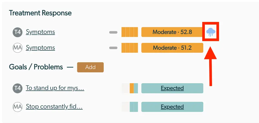
The screenshot displays a section of the Enhanced Feedback Report within the Mirah Collaborative Care platform, focusing on Treatment Response and Goals/Problems. Under 'Treatment Response', there are two entries labeled 'Symptoms' with identifiers 'T4' and 'MA'. Each entry includes a horizontal bar graph indicating the severity level, marked as 'Moderate' with scores of 52.8 and 51.2 respectively. To the right of these bars, there is a weather icon, possibly indicating mood or condition, highlighted with a red box and arrow. Below, the 'Goals/Problems' section lists two goals: 'To stand up for mys...' and 'Stop constantly fid...', each associated with the same identifiers 'T4' and 'MA'. Both goals have a status labeled 'Expected' in a teal box. An 'Add' button is located next to the 'Goals/Problems' heading, allowing users to add new goals or problems.

Details Panel

If there are points in the overview that require further understanding and exploration, all of the heatmaps and badges are clickable. Once an overview item has been clicked, an outline appears around the line item to orient the clinician to what they are viewing in the “Details” panel.
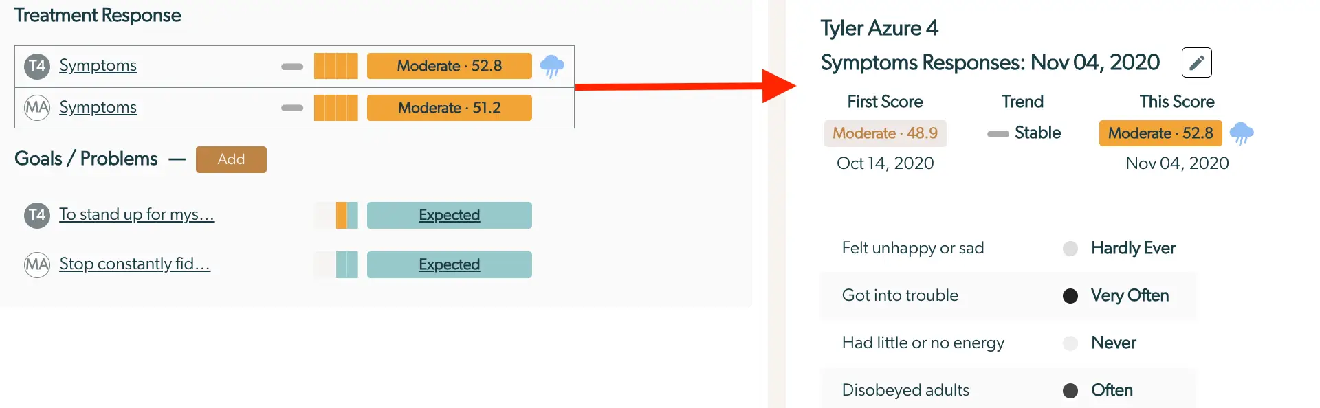
The screenshot displays the Enhanced Feedback Report feature of Mirah Collaborative Care, focusing on the Treatment Response and Goals/Problems sections. On the left, under Treatment Response, there are two entries labeled 'Symptoms' with scores of 52.8 and 51.2, both marked as 'Moderate' with a visual bar indicator and a weather icon suggesting the condition. Below, the Goals/Problems section lists two goals with abbreviated titles, each accompanied by a progress bar and an 'Expected' status link. On the right, the detailed view for 'Tyler Azure 4 Symptoms Responses' dated Nov 04, 2020, shows the First Score as 'Moderate 48.9' from Oct 14, 2020, and the current score as 'Moderate 52.8' with a stable trend. Below, there are symptom descriptions with frequency ratings such as 'Hardly Ever' and 'Very Often'. An edit icon is present at the top right of this section.

Scale Name and Heatmap Details

Selecting the scale name or the heatmap from the “Overview” panel opens a graphical representation of all administered scale scores in the “Details” panel. At the top of the right “Details” panel, there is a navigation trail to indicate this is the “Measure History”. It includes the name of the measure, a brief description of the measure, each past response presented in a line graph, a reminder of the respondent for the measure that is being viewed, and the latest score on the measure.
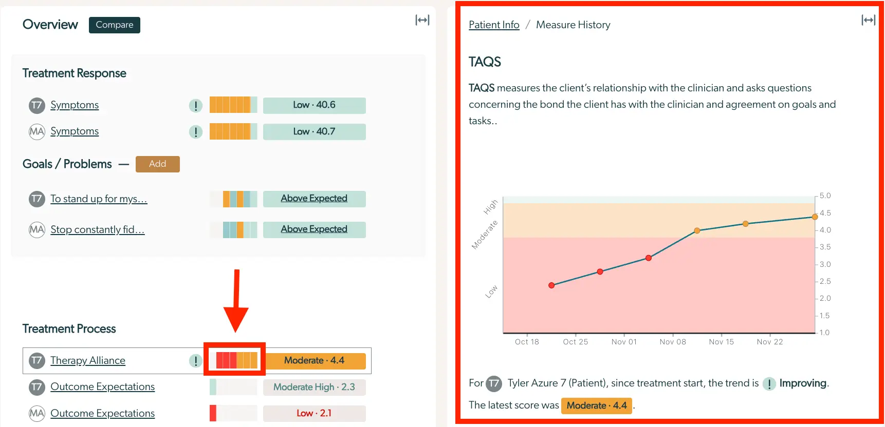
The screenshot displays the Enhanced Feedback Report within the Mirah Collaborative Care platform, focusing on the Treatment Response, Goals/Problems, and Treatment Process sections. On the left side, the Treatment Response section lists 'Symptoms' with a low score of 40.6 and 40.7, indicating the client's current symptom levels. The Goals/Problems section shows two goals: 'To stand up for myself' and 'Stop constantly fiddling,' both marked as 'Above Expected.' The Treatment Process section highlights 'Therapy Alliance' with a moderate score of 4.4, 'Outcome Expectations' with a moderate high score of 2.3, and another 'Outcome Expectations' with a low score of 2.1. The right side of the screen features a graph under 'TAQS,' which measures the client's relationship with the clinician, showing an improving trend for Tyler Azure 7, with the latest score being moderate at 4.4. The 'Compare' button is located at the top left, allowing users to compare different reports.

Hovering over the latest score gives additional details on the score including the date it was recorded, the exact score, and the severity that score corresponds to. As a reminder, this information is also available within the badge for the measure, in the “Overview” panel.
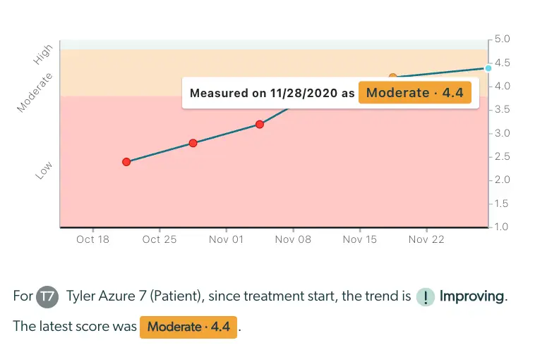
The screenshot displays an Enhanced Feedback Report graph for a patient named Tyler Azure 7, illustrating the trend of their treatment progress over time. The graph features a line chart with data points marked in red, indicating measurements taken on specific dates. The y-axis represents the score range from 1.0 to 5.0, categorized into Low, Moderate, and High zones, while the x-axis shows dates from October 18 to November 28. A tooltip is visible, highlighting a data point measured on November 28, 2020, with a score of 4.4, categorized as Moderate. Below the graph, a summary states that since the treatment start, the trend for Tyler Azure 7 is improving, with the latest score being Moderate at 4.4. The summary includes a patient identifier 'T7' and uses icons to emphasize the improving trend.

Within “Measure History” data points on the graph as well as the latest score can both be selected to show the individual item responses for the corresponding scale administration (see below).

Badge Details: Responses

Selecting the current score badge from the “Overview” panel opens the detailed, item level responses for the most recent administration of that measure. At the top of the “Details” panel, the navigation trail indicates this is the “Responses” view.

This view confirms the name of the respondent, the response date, and then outlines the first score that was ever recorded for the measure, any trend that exists for the measure, and the score that is currently being viewed. Additionally, the pencil icon allows the user to navigate and edit any of the responses that are documented. Following these details, each item on the scale is written with the correlating responses.
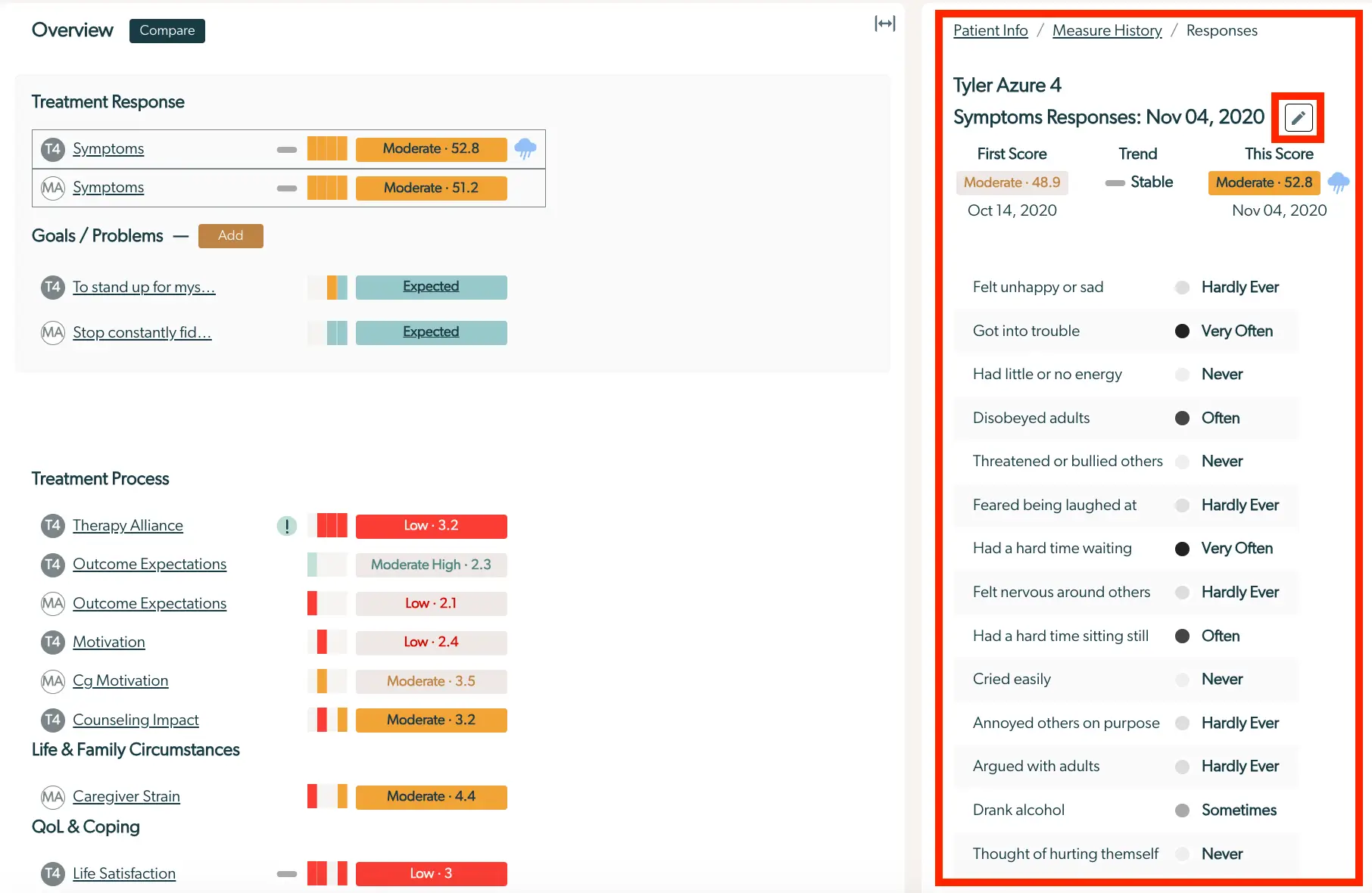
The screenshot displays the Enhanced Feedback Report for a patient named Tyler Azure, dated November 4, 2020. On the left side, the screen shows an overview of the patient's treatment response, goals/problems, treatment process, life and family circumstances, and quality of life and coping. Each section includes specific metrics such as 'Symptoms' with scores indicating 'Moderate' levels, 'Therapy Alliance' with a 'Low' score, and 'Caregiver Strain' with a 'Moderate' score. The right side of the screen provides detailed symptom responses, including frequency indicators like 'Hardly Ever', 'Very Often', and 'Never' for various behaviors and feelings. The 'First Score' and 'This Score' are compared, showing a trend from 'Moderate: 48.9' to 'Moderate: 52.8'. A pencil icon located at the top right corner allows for editing the report.

If applicable based on the scale, item alerts will be shown for each response with a red dot. This means that the answer given was in the top 25th percentile of negative responses in comparison to the psychometric sample.

Navigating back to the “Measure History”, other item level responses from different scale administrations may be viewed by selecting a data point on the graph or clicking on the latest score.

Additionally, the detailed item responses are populated when any of the risks in the top section are selected.
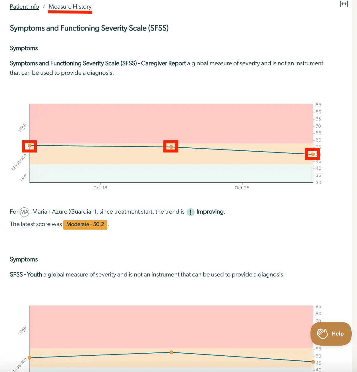
The screenshot displays the Enhanced Feedback Report for the Symptoms and Functioning Severity Scale (SFSS) within the Mirah Collaborative Care platform. The page is part of the Measure History section, as indicated by the breadcrumb navigation at the top. The report includes a graph showing the trend of severity scores over time, with a line graph illustrating the scores from October 18 to October 25. The graph is color-coded to represent different severity levels: High, Moderate, and Low. Below the graph, there is a summary statement indicating that for Mariah Azure (Guardian), the trend since treatment start is improving, with the latest score being Moderate at 50.2. The page also includes a section for SFSS - Youth, which similarly provides a global measure of severity. On the bottom right corner, there is a Help button for user assistance.

Navigating to Different Scales

At any time, details for a different scale can be viewed in the “Details” panel by selecting it from the “Overview” panel. Navigating among the scales will change the indicator box in the “Overview” panel, so the user is always oriented to the scale for which they are viewing the details.

Generate a Clinical Note

Within the Enhanced Feedback Report, users have the ability to view a clinical note with a summary of the report's findings.

1.) Click on the menu in the top right corner and select "Generate Clinical Report".
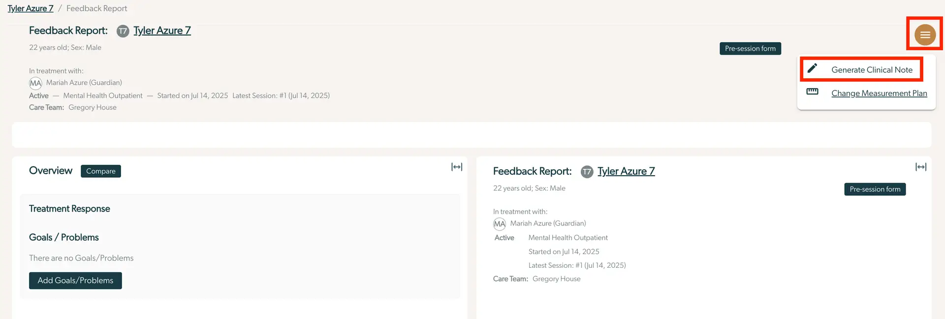
The screenshot displays the Enhanced Feedback Report for a patient named Tyler Azure, aged 22, male. The report indicates that Tyler is in treatment with Mariah Azure, who is listed as the guardian, and the care team includes Gregory House. The treatment is active under Mental Health Outpatient, having started on July 14, 2025, with the latest session also on July 14, 2025. The top right corner features a menu button, which when clicked, reveals options to 'Generate Clinical Note' and 'Change Measurement Plan'. Below the patient details, there is an 'Overview' section with a 'Compare' button next to it. The 'Treatment Response' and 'Goals/Problems' sections are visible, with a note stating there are no goals/problems currently listed. A button labeled 'Add Goals/Problems' is available for input. A 'Pre-session form' button is located on the right side of the 'Overview' section.

2.) The note will appear on the screen, detailing important information about the session and measurement responses. By selecting "Copy", this summary will be copied to your clipboard.
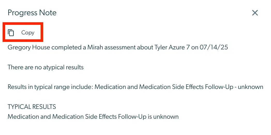
The screenshot displays a 'Progress Note' section from the Mirah Collaborative Care platform, specifically part of the Enhanced Feedback Report feature. At the top left, there is a 'Copy' button with an icon of two overlapping rectangles, allowing users to copy the text content of the progress note. The main content of the note states that Gregory House completed a Mirah assessment about Tyler Azure 7 on 07/14/25. It mentions that there are no atypical results and lists typical results, which include 'Medication and Medication Side Effects Follow-Up' with a status of unknown. The note concludes with a section labeled 'TYPICAL RESULTS' reiterating that the follow-up status is unknown. The 'Copy' button is located at the top left, and a close button, represented by an 'X', is at the top right corner of the screen.